Rais
27.Ноябрь.2016 09:45:36
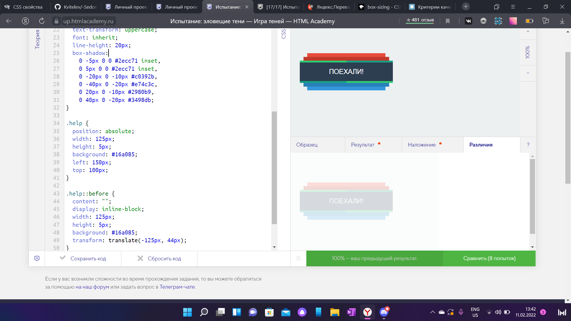
1
Прошу критики относительно внутренней сине-зелной рамки, правильным ли способом я ее сделал (ибо вариантов было несколько).
HTML:
<!DOCTYPE html>
<html lang="ru">
    <head>
        <meta charset="utf-8">
        <title>Испытание: зловещие тени</title>
    </head>
    <body>
        <div class="btn">Поехали!</div>
        <div class="help"></div>
    </body>
</html>
CSS:
html,
body {
    width: 300px;
    margin: 0;
    padding: 0;
    font-size: 18px;
    font-family: "Arial", sans-serif;
    background: #ecf0f1;
}

.btn {
    width: 250px;
    margin: 0 25px;
    margin-top: 100px;
    padding: 20px 0;
    line-height: 20px;
    text-align: center;
    text-transform: uppercase;
    color: white;
    background: #2c3e50;
    cursor: pointer;
    box-shadow:
        inset 0 5px 0 0 #2ecc71,
        inset 0 -5px 0 0 #2ecc71,
        0 20px 0 -10px #2980b9,
        0 40px 0 -20px #3498db,
        0 -20px 0 -10px #c0392b,
        0 -40px 0 -20px #e74c3c;
}
.help {
    width: 125px;
    height: 5px;
    background: #16a085;
    margin: -5px 25px;
    box-shadow: 125px -55px 0 0 #16a085;
}
Ineska
27.Ноябрь.2016 09:55:33
2
Вариант с позиционированием был бы лучше, я думаю.
1 лайк
Мой Вариант с позиционированием )
html,#ecf0f1 ;
.btn {#2c3e50 ;
.btn{#c0392b ,#e74c3c ,#2980b9 ,#3498db ,#2ecc71 ,#2ecc71 ;
.help{#16a085 ;#16a085 ;
}
кто использовал флоуты? Благодаря им внутреняя тень не разваливается при расширении кнопки и сужении( до определенного размера). При этом не приходится использовать градиент. Правд при градиенте кнопка даже при сильном сужении не разваливается.
See the Pen Зловещие тени, ужасающе громадная кнопка by Sergey (@muzimka ) on CodePen .
Ineska
10.Февраль.2017 17:10:48
5
Что-то ширина body у вас получилась меньше ширины самой кнопки…
1 лайк
можете поставить любую ширину ) работает от 179px, если меньше то надо джава скриптом корректировать.
body скорее всего было задано и я его не менял =)
LoG
14.Август.2017 09:08:56
9
я сделал как-то так#ecf0f1 ;#2c3e50 ;#2ecc71 ,#16a085 ,#c0392b ,#e74c3c ,#2980b9 ,#3498db ;#2ecc71 ,#16a085 ;
1 лайк
pan19
18.Август.2017 12:25:56
10
Мое решение:
html,
body {
    width: 300px;
    margin: 0;
    padding: 0;
    font-size: 18px;
    font-family: "Arial", sans-serif;
    background: #ecf0f1;
}

.btn {
    position: relative;
    width: 250px;
    margin: 0 25px;
    margin-top: 100px;
    padding: 20px 0;
    line-height: 20px;
    text-align: center;
    text-transform: uppercase;
    color: white;
    background: #2c3e50;
    cursor: pointer;
    box-shadow:
        inset 0px -5px 0 0 #2ecc71,
        inset 0px 5px 0 0 #2ecc71,
        0 -20px 0 -10px #c0392b,
        0 20px 0 -10px #2980b9,
        0 -40px 0 -20px #e74c3c,
        0 40px 0 -20px #3498db;
}
.btn:before,
.btn:after {
    content: "";
    position: absolute;
    width: 125px;
    height: 5px;
    background-color: #16a085;
}
.btn:before {
    left: 0;
    bottom: 0;
}
.btn:after {
    right: 0;
    top: 0;
}
2 лайка
nike
19.Сентябрь.2017 05:22:15
12
А вот мой вариант:
html,#ecf0f1 ;
.btn {#2c3e50 ;#16a085 ,#2ecc71 ,#c0392b ,#e74c3c ,#2980b9 ,#3498db ;
.help {#2ecc71 ,#16a085 ;
Мой:#ecf0f1 ;
.btn {#2c3e50 ;
      0 5px 0 0 #2ecc71,
      0 -5px 0 0 #2ecc71,
      0 -25px 0 -10px #c0392b,
      0 -45px 0 -20px #e74c3c,
      0 25px 0 -10px #2980b9,
      0 45px 0 -20px #3498db;
}#16a085 ,#16a085 ;
1 лайк
Решение на 100% без применения .help и псевдоэлементов (обратите внимание на измененный марджин-топ и паддинг):
Код
.btn {margin-top: 105px; #2c3e50 ;#ecf0f1 ,#ecf0f1 ,#16a085 ,#16a085 ,#2ecc71 ,#2ecc71 ,#c0392b ,#e74c3c ,#2980b9 ,#3498db ;
}
4 лайка
Ineska
11.Ноябрь.2017 07:39:27
15
Выделите измененные свойства для наглядности. Интересный вариант.
Mayor
14.Декабрь.2017 22:30:57
17
html,#ecf0f1 ;
.btn {#2c3e50 ;#2ecc71 ,#16a085 ,#c0392b ,#e74c3c ,#2980b9 ,#3498db ;
.help {#16a085 ,#2ecc71 ;
как по мне то не совсем прикольно выстраивать такие абракадабры, темболие вы берете цвет фона в тени добавляете а если цвет фона поменяется ваш вариант будет хуже чем с применением псевдоэлементов или .help)a
Тоже думал в эту сторону, но не хотелось изменять исходную геометрию кнопки, и меня увело в псевдоэлементы. А так по моему это самый логичный вариант для создания такого эффекта.
Sssgr
17.Февраль.2021 16:25:52
20
Собственно 99.9%. 100% устал делать. Как уж придумал.
 html,
    body {
      margin: 0;
      padding: 0;
      width: 300px;
      background-color: #ecf0f1;
      font-size: 18px;
      font-family: "Arial", sans-serif;
    }

    .btn {
      display: block;
      margin: 0 25px;
      margin-top: 100px;
      padding: 20px 0;
      width: 250px;
      border: none;
      box-sizing: content-box;
      background-color: #2c3e50;
      color: white;
      text-align: center;
      text-transform: uppercase;
      font: inherit;
      line-height: 20px;
      box-shadow:
        inset 0px -5px 0 0px #2ecc71,
        inset 0px 5px 0 0px #16a085,
        0 20px 0 -10px #2980b9,
        0 40px 0 -20px #3498db,
        0 -20px 0 -10px #c0392b,
        0 -40px 0 -20px #e74c3c
      ;
    }

    .help {
       box-shadow:
       -156.1px -144px 0px 6.1px #2ecc71,
       -156px -6.1px 0px 6.1px #16a085;
        transform: scale(0.4);
      }
Что-то ты намудрил. Все довольно просто:
.help {
  width: 125px;
  height: 5px;

  box-shadow:
    25px -60px 0 0 #2ecc71,
    150px -5px 0 0 #2ecc71;
}
1 лайк