.palette-small {
display: flex;
}
.palette-box:nth-of-type(1) .palette-small {
flex-direction: column-reverse;
justify-content: center;
}
.palette-box:nth-of-type(1) .palette-small div:nth-child(2) {
order: 1;
align-self: center;
}
.palette-box:nth-of-type(1) .palette-small div:nth-child(3) {
order: -1;
align-self: center;
}
.palette-box:nth-of-type(2) .palette-small {
flex-direction: column-reverse;
justify-content: space-between;
}
.palette-box:nth-of-type(2) .palette-small div:nth-of-type(1),
.exam .palette-box:nth-of-type(2) .palette-small div:nth-of-type(2) {
align-self: flex-end;
}
.palette-box:nth-of-type(2) .palette-small div:nth-of-type(3),
.palette-box:nth-of-type(2) .palette-small div:nth-of-type(4) {
align-self: flex-start;
}
.palette-box:nth-of-type(3) .palette-small {
justify-content: space-between;
}
.palette-box:nth-of-type(3) .palette-small .part:nth-of-type(1),
.palette-box:nth-of-type(3) .palette-small .part:nth-of-type(2) {
display: flex;
flex-direction: column;
justify-content: space-between;
align-items: center;
}
.palette-box:nth-of-type(4) .palette-small{
justify-content: space-between;
}
.palette-box:nth-of-type(4) .palette-small .part:nth-of-type(1){
display: flex;
}
.palette-box:nth-of-type(4) .palette-small .part:nth-of-type(2){
display: flex;
flex-direction: column-reverse;
justify-content: space-between;
}
Круто, Бро!
Я тоже смог)) Мой вариант
    /* Palette-1 */

    .palette-box:first-child .palette-small {
      display: flex;
      justify-content: center;
      flex-direction: column-reverse;
    }

    .palette-box:first-child .color-3 {
      align-self: center;
      order: 1;
    }

    .palette-box:first-child .color-4 {
      align-self: center;
      order: -1;
    }

    /* Palette-2 */

    .palette-box:nth-child(2) .palette-small {
      display: flex;
      justify-content: space-between;
      flex-direction: column-reverse;
    }

    .palette-box:nth-child(2) div:nth-child(n+3) {
      align-self: flex-start;
    }

    .palette-box:nth-child(2) div:nth-child(-n+2) {
      align-self: flex-end;
    }

    /* Palette-3 */

    .palette-box:nth-child(3) .palette-small {
      display: flex;
      justify-content: space-between;
    }

    .palette-box:nth-child(3) .palette-small div:first-child {
      display: flex;
      flex-direction: column;
      justify-content: space-between;
    }

    .palette-box:nth-child(3) .palette-small div:last-child {
      display: flex;
      flex-direction: column;
      justify-content: space-between;
    }

    /* Palette-4 */

    .palette-box:last-child .palette-small {
      display: flex;
      justify-content: space-between;
    }

    .palette-box:last-child .palette-small div:first-child {
      display: flex;
    }

    .palette-box:last-child .palette-small div:last-child {
      display: flex;
      flex-direction: column-reverse;
      justify-content: space-between;
}Мой вариант
.palette-small {
  display: flex;
}
.palette-box:first-child .palette-small {

flex-direction: column;

justify-content: center;

}
.palette-box:first-child .palette-small .color-3 {

order: -2;

align-self: center;

}
.palette-box:first-child .palette-small .color-5 {

order: -1;

}
.palette-box:first-child .palette-small .color-4 {

align-self: center;

}
.palette-box:nth-child(2) .palette-small {

flex-direction: column-reverse;

justify-content: space-between;

}
.palette-box:nth-child(2) .palette-small div:nth-child(-n+2)
{

align-self: flex-end;
}
.palette-box:nth-child(2) .palette-small div:nth-child(n+3)
{

align-self: flex-start;
}
.palette-box:nth-child(3) .palette-small {

justify-content: space-between;

display: flex;
}
.palette-box:nth-child(3) .palette-small .part {

display: flex;

flex-direction: column;

justify-content: space-between;

}
.palette-box:nth-child(4) .palette-small {

justify-content: space-between;

display: flex;

}
.palette-box:nth-child(4) .palette-small .part{

display: flex;

}
.palette-box:nth-child(4) .palette-small .part:last-child {

justify-content: space-between;

flex-direction: column-reverse;

}
Вот мой вариант, старался использовать более-менее короткие селекторы
/* Общие для всех */
.palette-small {
display: flex;
}
/* Первая палитра */
.palette-box:nth-child(1) .palette-small {
flex-direction: column-reverse;
justify-content: center;
}
.palette-box:nth-child(1) .color-3 {
order: 1;
align-self: center;
}
.palette-box:nth-child(1) .color-4 {
order: -1;
align-self: center;
}
/* Вторая палитра */
.palette-box:nth-child(2) .palette-small {
flex-direction: column-reverse;
justify-content: space-between;
align-items: flex-start;
}
.palette-box:nth-child(2) .color-2,
.palette-box:nth-child(2) .color-6 {
align-self: flex-end;
}
/* Третья и четвертая палитры*/
.palette-box:nth-child(3) .palette-small,
.palette-box:nth-child(4) .palette-small {
justify-content: space-between;
}
.part {
display: flex;
justify-content: space-between;
flex-direction: column;
}
.palette-box:nth-child(4) .part:first-child {
flex-direction: row;
}
.palette-box:nth-child(4) .part:last-child {
flex-direction: column-reverse;
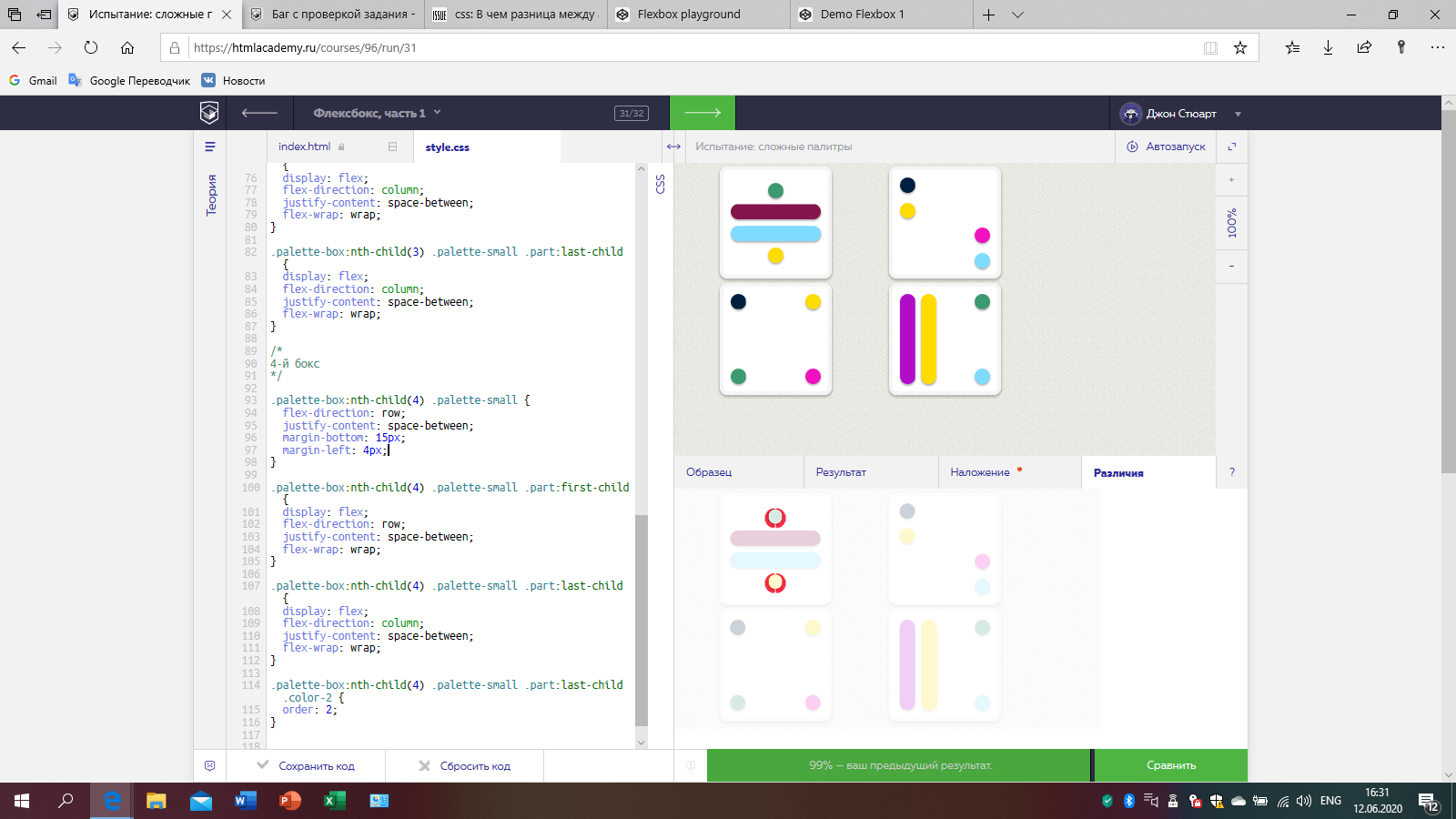
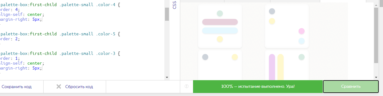
}А меня достали мои 99%. Помогите найти несостыковку пожалуйста.
.exam {
display: flex;
flex-wrap: wrap;
justify-content: center;
align-content: center;
}
.palette-small {
display: flex;
flex-direction: column;
margin-left: 4px;
}
/*
1-й бокс
*/
.palette-box:first-child .palette-small {
justify-content: center;
margin-left: 0px;
}
.palette-box:first-child .palette-small .color-2 {
order: 3;
}
.palette-box:first-child .palette-small .color-4 {
order: 4;
align-self: center;
}
.palette-box:first-child .palette-small .color-5 {
order: 2;
}
.palette-box:first-child .palette-small .color-3 {
order: 1;
align-self: center;
}
/*
2-й бокс
*/
.palette-box:nth-child(2) .palette-small {
flex-direction: column-reverse;
justify-content: space-between;
}
.palette-box:nth-child(2) .palette-small .color-2 {
align-self: flex-end;
}
.palette-box:nth-child(2) .palette-small .color-6 {
align-self: flex-end;
}
.palette-box:nth-child(2) .palette-small .color-4 {
align-self: flex-start;
}
.palette-box:nth-child(2) .palette-small .color-1 {
align-self: flex-start;
}
/*
3-й бокс
*/
.palette-box:nth-child(3) .palette-small {
flex-direction: row;
justify-content: space-between;
margin-left: 0px;
}
.palette-box:nth-child(3) .palette-small .part:first-child {
display: flex;
flex-direction: column;
justify-content: space-between;
flex-wrap: wrap;
}
.palette-box:nth-child(3) .palette-small .part:last-child {
display: flex;
flex-direction: column;
justify-content: space-between;
flex-wrap: wrap;
}
/*
4-й бокс
*/
.palette-box:nth-child(4) .palette-small {
flex-direction: row;
justify-content: space-between;
margin-bottom: 15px;
margin-left: 4px;
}
.palette-box:nth-child(4) .palette-small .part:first-child {
display: flex;
flex-direction: row;
justify-content: space-between;
flex-wrap: wrap;
}
.palette-box:nth-child(4) .palette-small .part:last-child {
display: flex;
flex-direction: column;
justify-content: space-between;
flex-wrap: wrap;
}
.palette-box:nth-child(4) .palette-small .part:last-child .color-2 {
order: 2;
}
Добрый день!
Подвиньте два элемента, находящихся не на месте, внешним отступом вправо на 5 пикселей и всё встанет на свои места.
Вы проверяли?
Да, подвинула эти два элемента в вашем коде и получила 100% совпадение.
Вот мой)
.palette-small{display: flex;
flex-direction: column-reverse;
justify-content: space-between;
}.palette-box:nth-of-type(1) .palette-small{
justify-content: center;
}.palette-box:nth-of-type(1) .palette-small div:nth-child(2),
.palette-box:nth-of-type(1) .palette-small div:nth-child(3){
align-self: center;
}.palette-box:nth-of-type(1) .palette-small div:nth-child(2){
order: 1;
}.palette-box:nth-of-type(1) .palette-small div:nth-child(3){
order: -1;
}.palette-box:nth-of-type(2) .palette-small div:nth-child(3),
.palette-box:nth-of-type(2) .palette-small div:nth-child(4){
align-self: flex-start;
}.palette-box:nth-of-type(2) .palette-small div:nth-child(1),
.palette-box:nth-of-type(2) .palette-small div:nth-child(2){
align-self: flex-end;
}.palette-box:last-of-type .palette-small{
display: flex;
flex-direction: row;
justify-content: space-between;
}.palette-box:nth-last-of-type(2) .palette-small{
display: flex;
flex-direction: row;
justify-content: space-between;
}.part{
display: flex;
flex-direction: column;
justify-content: space-between;
}.palette-box:last-of-type .part:first-child{
display: flex;
flex-direction: row;
}.palette-box:last-of-type .part:last-child{
flex-direction: column-reverse;
}
Наиболее короткий вариант, который смог сделать:
.palette-small, .part {
  display: flex;
  justify-content: space-between;
}

.palette-box:first-of-type .palette-small {
  flex-direction: column-reverse;
  justify-content: center;
}

.palette-box:first-of-type .palette-small .color-3 {
  order: 1;
  align-self: center;
}

.palette-box:first-of-type .palette-small .color-4 {
  order: -1;
  align-self: center;
}

.palette-box:nth-of-type(2) .palette-small,
.palette-box:last-of-type .palette-small .part:last-of-type {
  flex-direction: column-reverse;
  align-items: flex-start;
}

.palette-box:nth-of-type(2) .palette-small .color-2,
.palette-box:nth-of-type(2) .palette-small .color-6 {
  align-self: flex-end;
}

.palette-box:nth-of-type(3) .palette-small .part {
  flex-direction: column;
}Это испытание (задача) не про flex.
Это про использование :nth-child(…), :nth-of-type и прочее… )))
Код ужасен. Но. Работает )
.palette-small{
display: flex;
flex-direction: column-reverse;
justify-content: space-between;
}
.palette-box:first-child>div:not(.part){
display: flex;
justify-content: center;
}
.palette-box:first-child>div:not(.part)>div:nth-child(1){
align-self: stretch;
}
.palette-box:first-child>div:not(.part)>div:nth-child(3){
align-self: center;
order: -1;
}
.palette-box:nth-child(3)>.palette-small:first-child{
display: flex;
flex-direction: row;
}
.palette-box:nth-child(3)>.palette-small>.part{
display: flex;
flex-direction: column;
justify-content: space-between;
}
.palette-box:nth-child(4)>.palette-small:first-child{
display: flex;
flex-direction: row;
}
.palette-box:nth-child(4)>.palette-small>.part:first-child{
display: flex;
flex-direction: row;
}
.palette-box:nth-child(4)>.palette-small>.part:first-child>.color-4{
align-self: stretch;
}
.palette-box:nth-child(4)>.palette-small .part:nth-child(2){
display: flex;
flex-direction: column-reverse;
justify-content: space-between;
}
.color-1{
align-self: flex-start;
}
.color-2{
align-self: flex-end;
}
.palette-small>.color-3{
align-self: center;
order: 1;
}
.color-4{
align-self: flex-start;
}
.color-6{
align-self: flex-end;
}
.palette-small, .part {
display: flex;
justify-content: space-between;
}
/---------------------------------------------------------------------/
.palette-box:nth-of-type(1) .palette-small {
flex-direction: column;
justify-content: center;
}
.palette-box:nth-of-type(1) .color-3 {order: 1; align-self: center;}
.palette-box:nth-of-type(1) .color-5 {order: 2;}
.palette-box:nth-of-type(1) .color-2 {order: 3; }
.palette-box:nth-of-type(1) .color-4 {order: 4; align-self: center;}
/---------------------------------------------------------------------/
.palette-box:nth-of-type(2) .palette-small {
flex-direction: column-reverse;
}
.palette-box:nth-of-type(2) .color-1,
.palette-box:nth-of-type(2) .color-4 {align-self: flex-start;}
.palette-box:nth-of-type(2) .color-2,
.palette-box:nth-of-type(2) .color-6 {align-self: flex-end;}
/---------------------------------------------------------------------/
.palette-box:nth-of-type(3) .part{
flex-direction: column;
}
/---------------------------------------------------------------------/
.palette-box:nth-of-type(4) .part:nth-of-type(2){
flex-direction: column-reverse;
}