Для третьей палитры я написал следующий код:
.palette-box:nth-child(3) .palette-small {
display: flex;
justify-content: space-between;
}
.palette-box:nth-child(3) .part {
display: flex;
border: 2px solid black;
}
Выглядит это так: 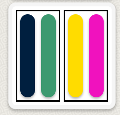
Если далее сделать для .part направление основной оси сверху вниз (flex-direction: column), то получится так:
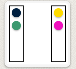
Почему после смены направления основной оси для .part цветные полоски не растягиваются по горизонтали вдоль поперечной оси?
Почему дефолтное свойство элемента .part {align-items: stretch;} в роли флекс-контейнера оказывается менее приоритетным, чем его же свойство сжимания до минимальной ширины , когда он выступает уже в роли флекс-элемента?
Может так сделать?
/Первый блок/
.palette-box:first-child .palette-small {
display: flex;
flex-direction: column;
justify-content: center;
}
.palette-box:first-child .color-2 {
order: 3;
}
.palette-box:first-child .color-3 {
order: 1;
align-self: center;
}
.palette-box:first-child .color-4 {
order: 4;
align-self: center;
}
.palette-box:first-child .color-5 {
order: 2;
}
/Второй блок/
.palette-box:nth-child(2) .palette-small {
display: flex;
flex-direction: column;
justify-content: space-between;
}
.palette-box:nth-child(2) .color-1 {
order: 1;
align-self: flex-start;
}
.palette-box:nth-child(2) .color-2 {
order: 4;
align-self: flex-end;
}
.palette-box:nth-child(2) .color-4 {
order: 2;
align-self: flex-start;
}
.palette-box:nth-child(2) .color-6 {
order: 3;
align-self: flex-end;
}
/Третий блок/
.palette-box:nth-child(3) .palette-small {
display: flex;
justify-content: space-between;
}
.palette-box:nth-child(3) .part:first-child {
display: flex;
flex-direction: column;
justify-content: space-between;
}
.palette-box:nth-child(3) .part:nth-child(2) {
display: flex;
flex-direction: column;
justify-content: space-between;
}
/Четвертый блок/
.palette-box:nth-child(4) .palette-small {
display: flex;
justify-content: space-between;
}
.palette-box:nth-child(4) .part:first-child {
display: flex;
}
.palette-box:nth-child(4) .part:nth-child(2) {
display: flex;
flex-direction: column-reverse;
justify-content: space-between;
}

