Микросетки. Продолжение. Испытание: Панель управления

Код на 100%. Однако у меня вопрос: есть ли способы его оптимизировать и сократить?

.tabs-list{
width: 180px;
margin: 0;
padding: 0;
display: flex;
flex-direction: column;
}

.charts {
margin-top: 0;
margin-bottom: 15px;
}

.clients {
margin-top: 0;
margin-bottom: 15px;
}

.messages {
margin-top: 0;
margin-bottom: 15px;
}

.documents {
margin-top: 0;
margin-bottom: 15px;
}

.projects {
margin-top: 0;
margin-bottom: 15px;
}

.settings {
margin-top: 0;
margin-bottom: 15px;
}

.trash{
margin-top: 0;
}
.active {
align-self:flex-end;
}

.content {
width:280px;
padding: 20px 30px;
display: flex;
flex-direction: column;
align-items: center;
}

.image {
max-width: 100%;
height: auto;
order: -1;
margin-top: 0;
margin-bottom: 15px;
}

.author {
order: -1;
align-self: flex-start;
margin-top: 0;
margin-bottom: 15px;
}

.title {
margin-top: 0;
margin-bottom: 5px;
}

.message {
margin-top: 0;
margin-bottom: 20px;
}

Можно сократить, если вместо перечисления каждого класса в списке, использовать общий для каждой категории селектор tab, а последнему указать нулевой margin;

.tab {
margin-top:0;
margin-bottom: 15px;
}
.tab:nth-child(7){
margin-bottom: 0px;
}

3 лайка

.tabs-list {
width: 180px;
margin: 0;
padding: 0;
display: flex;
flex-direction: column;
}

.tab {
margin-bottom: 15px;
}
.tab:last-child {
margin-bottom: 0px;
}

.active {
margin-left: auto;
}

.content {
width: 280px;
padding: 20px 30px;
display: flex;
flex-direction: column;
align-items: center;

}

.image {
max-width: 100%;
height: auto;
order: -1;
margin-bottom: 15px;
}

.author {
order: -1;
margin-right: auto;
margin-bottom: 15px;
}

h2 {
margin:0 0 5px 0;
}

.message {
margin: 0 0 20px 0;
}

1 лайк

.tabs-list{
width : 180px;
margin : 0;
padding : 0;
display : flex;
flex-direction : column;
}
.tab {
margin : 15px 0px 0 0;
}
.tab:first-child {
margin : 0;
}
.active {
align-self : flex-end;
}

.content {
display : flex;
padding : 20px 30px;
flex-direction : column;
align-items : center;
width : 280px;
}
.author {
align-self : flex-start ;
order : -2;
margin-bottom : 15px;
}
.image {
order : -1;
margin-bottom : 2px;
max-width : 100%;
height : auto;
}
.title {
margin-bottom : 5px;
}
.message {
margin : 0 0 20px 0;
}

.tabs-list{
width : 180px;
margin : 0;
padding : 0;
display : flex;
flex-direction : column;
}

.tab {
margin : 15px 0px 0 0;
}
.tab:first-child {
margin : 0;
}

.active {
align-self : flex-end;
}

.content {
display : flex;
padding : 20px 30px;
flex-direction : column;
align-items : center;
width : 280px;
}

.author {
align-self : flex-start ;
order : -2;
margin-bottom : 15px;
}

.image {
order : -1;
margin-bottom : 15px;
max-width : 100%;
height : auto;
}

.title {
margin: 0;
margin-bottom: 5px;
}

.message {
margin: 0;
margin-bottom: 20px;
}

.reply-link {
margin: 0;
margin-bottom: 0;
}

Подскажите, что не так?
.tabs-list {
display: flex;
flex-direction: column;
width: 180px;
margin: 0;
padding: 0;
}

.tab {
align-self: flex-start;
margin-bottom: 15px;
}

.active {
align-self: flex-end;
}

.content {
display: flex;
flex-direction: column;
width: 280px;
padding: 20px 30px;
margin: 0;
}

.title {
order: 2;
margin-top: 15px;
margin-bottom: 5px;
text-align: center;
}

.author-name {
margin-top: 0;
margin-bottom: 15px;
}

.image {
margin-top: 0;
max-width: 100%;
height: auto;
}

.message {
order: 3;
margin: 0;
}

.reply-link {
order: 4;
align-self: center;
margin-bottom: 0;
margin-top: 20px;
}

Подскажите, пожалуйста, где ошибка. Уже всю голову сломал)

.tab:nth-child(7){
margin-bottom: 0px;
}

для корзины нужно сделать отступ 0

вот мой код на 100%

.tabs-list {
display: flex;
flex-direction: column;
margin:0;
padding:0;
width: 180px;
}

.tab {
margin-top:0;
margin-bottom: 15px;
}

.tab:nth-child(7){
margin-bottom: 0px;
}

.active {
align-self: flex-end;
}

.content {
width:280px;
padding: 20px 30px;
display:flex;
flex-direction:column;
}

.image {
max-width:100%;
height:auto;
order:-1;
margin-bottom: 15px;
margin-top:0;
}

.author{
order:-1;
margin-bottom: 15px;
margin-top:0;
align-self:flex-start;
}

.title {
margin-top:0;
margin-bottom:5px;
align-self:center;
}

.message {
margin-top:0;
margin-bottom:0px;
}

.reply-link{
align-self:center;
margin-top:20px;
}

мой вариант чуть покороче, тоже на 100%.

.tabs-list {
display: flex;
flex-direction: column;
width: 180px;
margin: 0;
padding: 0;
}

.tab {
margin-bottom: 15px;
margin-top: 0;
}

.tab:nth-child(7) {
margin-bottom: 0px;
}

.active {
align-self: flex-end;
}

.content {
display: flex;
flex-direction: column;
width: 280px;
align-items: center;
padding: 20px 30px;
}

.image {
order: -1;
max-width: 100%;
height: auto;
margin-top: 0;
margin-bottom: 15px;
}

.author {
order: -1;
align-self: flex-start;
margin-top: 0;
margin-bottom: 15px;
}

.title {
margin-top: 0;
margin-bottom: 5px;
}

.message {
margin-top: 0;
margin-bottom: 20px;
}

Добрый день! Выполнил на 100%, увидел что размещение в активном окне можно было сделать через “order” в 2-х правилах для классов, вместо моих 3-х.

Хотел узнать ли возможно было задать ФИКСИРОВАНОЕ значение для “.content” не подбирая размер, а указать какую-то команду что бы размер был как раз четко по размеру родителя с правильным отступом.

Мой код:
.tabs-list, .content {
display: flex;
flex-direction: column;
margin: 0px;
padding:0px;
}

.active {
align-self: flex-end;
}

.tabs-list {
width: 180px;
}

.content {
width: 280px;
padding: 20px 30px;
align-items: center;
}

.author {
order: -1;
padding-bottom: 15px;
align-self: flex-start;
}

.image {
order: -1;
max-width: 100%;
height: auto;
margin-top: 0px;
margin-bottom: 15px;
}

.title {
margin-top: 0px;
margin-bottom: 5px;
}

.message {
margin-top: 0px;
margin-bottom: 20px;
}

.tab {
margin-top: 0px;
margin-bottom: 15px;
}

.tab:last-child {
margin-bottom: 0px;
}

.tabs-list {
display: flex;
flex-direction: column;
gap: 15px;
width: 180px;
margin: 0;
padding: 0;
}

.content {
display: flex;
width: 280px;
flex-direction: column;
padding: 20px 30px;
align-items: center;
}

.active {
align-self: flex-end;
}

.author {
order: 0;
margin-bottom: 15px;
margin-top: 0;
align-self: flex-start;
}

.image {
order: 1;
max-width: 100%;
height: auto;
margin-bottom: 15px;
margin-top: 0;
}

.title {
order: 2;
margin-bottom: 5px;
margin-top: 0;
}

.message {
order: 3;
margin-bottom: 20px;
margin-top: 0;
}

.reply-link {
order: 4;
margin-bottom: 0;
margin-top: 0;
}

Понимаю, что задание на повторение flex и его свойств, но если списку не задавать display: flex; задание тоже проходится:

.tabs-list {
margin: 0;
padding: 0;
width: 180px;
}

.tab:not(:last-child) {
margin-bottom: 15px;
}

.active {
margin-left: 20px;
}

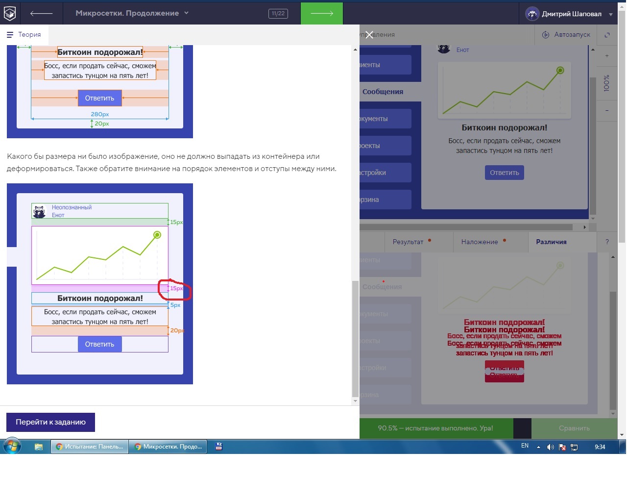
Добрый день. Подскажите, почему в классе .image есть margin-bottom: 2px; ?
Я второй день думаю и не могу понять откуда взялся этот отступ. В макете его нет.

Здравствуйте! Подскажите.пожалуйста.почему класс в css .activ а не .tab active?

.tabs-list {
width: 180px;
padding: 0;
margin: 0;
display: flex;
flex-direction: column;
gap: 15px;
}
.content {
width: 280px;
display: flex;
flex-direction: column;
align-items: center;
padding: 20px 30px;
}
.active {
align-self: flex-end;
}
.author {
align-self: start;
margin-bottom: 15px;
}
.image {
max-width: 100%;
height: auto;
margin-bottom: 15px;
}
.title, .message, .reply-link {
margin: 0;
order: 1;
}
.title {
margin-bottom: 5px;
}
.message {
margin-bottom: 20px;
}

В макете указан отступ


можно использовать класс .active или .tab.active. Сразу не увидел что у этого тега есть еще второй класс, и использовал другую функцию.

Не претендую на супер лаконичность кода, т.к. выполнял задачу второпях, но, возможно, кому-то окажется полезным:

.tabs-list {
width: 180px;padding:0;margin:0;
}
.tab{display:block;margin-bottom:15px}
.tab:last-child{margin-bottom:0}
.active{margin-left:20px}
.content{
width:280px;
padding-right:30px;padding-left:30px;
padding-top:20px;padding-bottom:20px;
display:flex;
flex-direction:column;
align-items:flex-start
}
.author-name{order:1;padding-bottom:15px}
.image{order:2; max-width: 100%;height: auto;padding-bottom:1px}
.title{order:3;padding:0;align-self:center;margin-bottom:5px}
.message{order:4;padding-bottom:6px;margin-top:0}
.reply-link{order:5;align-self:center}

Вот такой вариант еще на 100%)

tabs-list {
width: 180px;
margin: 0;
padding: 0;
display: flex;
flex-direction: column;
gap: 15px;
}

.active {
margin-left: auto;
}

.content {
align-items: center;
width: 280px;
padding: 20px 30px;
display: flex;
flex-direction: column;
}

.image {
max-width: 100%;
height: auto;
order: 1;
margin: 0;
padding-bottom: 15px;
}

.title {
order: 2;
margin: 0;
padding-bottom: 5px;
}

.message {
order: 3;
margin: 0;
padding-bottom: 20px;

}

.reply-link {
order: 4;
margin: 0;
}

.author{
margin-right: auto;
padding-bottom: 15px;
}