Селекторы. Часть 2 / Испытание: псевдоэлементы [19/20]

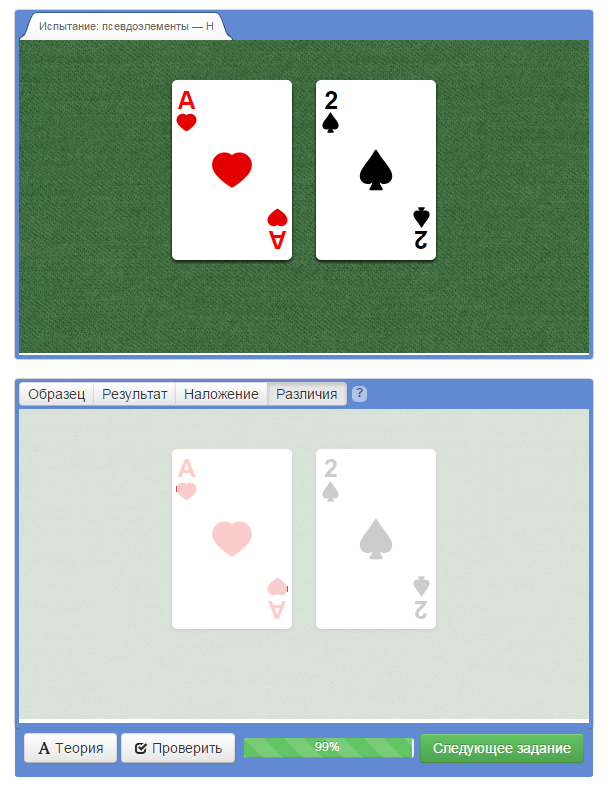
Не могу добить до 100% это задание. В различиях выдает, что контуры черви полные. А в задании они немного срезанные. Лучше наверное будет если оставить картинку в полном размере без срезов? Или у меня в коде ошибка?

Код CSS:

html, body {
margin: 0;
padding: 0;
font-family: “Arial”, sans-serif;
line-height: 30px;
}

body {
min-width: 550px;
min-height: 290px;
padding: 10px;
}

.two-cards {
width: 350px;
height: 250px;
padding: 10px;
text-align: center;
}

.two-cards div {
position: relative;
display: inline-block;
width: 120px;
height: 180px;
margin: 0 10px;
margin-top: 30px;
vertical-align: middle;
background-color: white;
border-radius: 5px;
box-shadow: 0px 2px 4px rgba(0, 0, 0, 0.8);
}

/* Ширина иконок, не изменяйте */
.two-cards div::before,
.two-cards div::after {
width: 20px;
}

/* Поворот нижней иконки */
.two-cards div::after {
transform: rotate(180deg);
}
.two-cards .ace-heart {
background-image: url("/assets/course57/heart.svg");
background-repeat: no-repeat;
background-position: center;
background-size: 50px;
}
.two-cards .ace-heart::before {
content: “A”;
float: left;
padding: 5px;
font-size: 25px;
font-weight: bold;
background: url("/assets/course57/heart.svg") no-repeat 49% 100%;
padding-bottom: 20px;
background-size: 25px;
color: red;
}
.two-cards .ace-heart::after {
content: “A”;
float: right;
padding: 5px;
font-size: 25px;
font-weight: bold;
background: url("/assets/course57/heart.svg") no-repeat 49% 20%;
background-position: 2px 30px;
padding-bottom: 145px;
background-size: 25px;
color: red;
}
.two-cards .two-spade {
background-image: url("/assets/course57/spade.svg");
background-repeat: no-repeat;
background-size: 50px;
background-position: center;
}
.two-cards .two-spade::before {
content: “2”;
float: left;
padding: 5px;
font-size: 25px;
font-weight: bold;
background: url("/assets/course57/spade.svg") no-repeat 49% 100%;
padding-bottom: 20px;
background-size: 25px;
color: red;
color: black;
}
.two-cards .two-spade::after {
content: “2”;
float: right;
padding: 5px;
font-size: 25px;
font-weight: bold;
background: url("/assets/course57/spade.svg") no-repeat 49% 20%;
background-position: 2px 30px;
padding-bottom: 145px;
background-size: 25px;
color: black;
}

Возможно, вам стоит выбрать одно из двух значений для background-position. У вас задано дважды:
background: url("/assets/course57/heart.svg") no-repeat 49% 20%;
background-position: 2px 30px;

Не помогло.

Попробуйте позиционировать псевдоэлементы с помощью свойства display вместо float. Внутренний отступ снизу в 145px выглядит не очень хорошо.
Будем пробовать разные варианты, если вы не против.

Попробуй через position: absolute; сделать оба элемента after и before, и да двойное указание позиции background не хорошо.

1 лайк

Теперь 100% :))

.two-cards .ace-heart::before {
content:“A”;
color: red;
font-size: 25px;
font-weight: bold;
position: absolute;
padding-bottom: 20px;
top:5px;
left:5px;
background: url(/assets/course57/heart.svg) no-repeat 50% 100%;
background-size:25px auto;
}
.two-cards .ace-heart::after {
content:“A”;
color: red;
font-size: 25px;
font-weight: bold;
position: absolute;
padding-bottom: 20px;
right: 5px;
bottom:5px;
background: url(/assets/course57/heart.svg) no-repeat 50% 100%;
background-size:25px auto;

1 лайк

100% код

html,
body {
margin: 0;
padding: 0;
font-family: “Arial”, sans-serif;
line-height: 30px;
}

body {
min-width: 550px;
min-height: 290px;
padding: 10px;
}

.two-cards {
width: 350px;
height: 250px;
padding: 10px;
text-align: center;
}

.two-cards div {
position: relative;
display: inline-block;
width: 120px;
height: 180px;
margin: 0 10px;
margin-top: 30px;
vertical-align: middle;
background-color: white;
border-radius: 5px;
box-shadow: 0px 2px 4px rgba(0, 0, 0, 0.8);
}
.ace-heart::before {
content:“A”;
color: red;
font-size: 25px;
font-weight: bold;
position: absolute;
padding-bottom: 20px;
top: 5px;
left: 5px;
background: url(heart.svg) no-repeat 50% 100%;
background-size: 25px auto;
}
.ace-heart::after {
content:“A”;
color: red;
font-size: 25px;
font-weight: bold;
position: absolute;
padding-bottom: 20px;
right: 5px;
bottom: 5px;
background: url(heart.svg) no-repeat 50% 100%;
background-size: 25px auto;

}

.ace-heart {
background: url(“heart.svg”) no-repeat 50% 50%;
background-size: 50px;
background-color: white;
}

.two-spade {
background: url(“spade.svg”) no-repeat 50% 50%;
background-size: 50px;
background-color: white;
}

.two-spade::before {
content: “2”;
font-size: 25px;
font-weight: bold;
position: absolute;
left: 5px;
top: 5px;
background: url(“spade.svg”) no-repeat 50% 100%;
padding-bottom: 20px;
background-size: 25px;
}

.two-cards div.two-spade::after {
content: “2”;
color: black;
font-size: 25px;
font-weight: bold;
position: absolute;
bottom: 5px;
right: 5px;
background: url(“spade.svg”) no-repeat 50% 100%;
padding-bottom: 20px;
background-size: 25px;
}

/* Ширина иконок, не изменяйте */
.two-cards div::before,
.two-cards div::after {
width: 20px;
}

/* Поворот нижней иконки */
.two-cards div::after {
transform: rotate(180deg);
}

В задании сказано " Все размеры шрифта и фоновых изображений, координаты указаны в пикселях и кратны 5"
Почему же все пишут координаты в процентах? С пикселями вот не выходит

background-position - не координаты
вы их можете хоть ключевыми словами даже писать

Пишу код тот что писал я. Тот что было написано разработчиком задания остался без изменений

.ace-heart {
background: url(“heart.svg”) no-repeat 50% 50%;
background-size: 50px;
}

.two-spade {
background: url(“spade.svg”) no-repeat 50% 50%;
background-size: 50px;
}

.ace-heart::before {
content: “A”;
position: absolute;
font-weight: bold;
left: 5px;
top: 5px;
color: red;
font-size: 25px;
padding-bottom: 20px;
background: url(“heart.svg”) no-repeat 50% 100%;
background-size: 25px;
}
.ace-heart::after {
content: “A”;
position: absolute;
font-weight: bold;
right: 5px;
bottom: 5px;
color: red;
padding-bottom: 20px;
font-size: 25px;
background: url(“heart.svg”) no-repeat 50% 100%;
background-size: 25px;
}

.two-spade::before {
content: “2”;
position: absolute;
font-weight: bold;
left: 5px;
top: 5px;
color: black;
font-size: 25px;
padding-bottom: 20px;
background: url(“spade.svg”) no-repeat 50% 100%;
background-size: 25px;}

.two-spade::after {
content: “2”;
position: absolute;
font-weight: bold;
right: 5px;
bottom: 5px;
color: black;
padding-bottom: 20px;
font-size: 25px;
background: url(“spade.svg”) no-repeat 50% 100%;
background-size: 25px;
}

Код перед комментарием не менял. 100%

/* Поворот нижней иконки */
.two-cards div::after {
transform: rotate(180deg);
bottom: 5px;
right: 5px;
}

.two-cards div::before {
top: 5px;
left: 5px;
}

.ace-heart::before,
.ace-heart::after {
content: “A”;
position: absolute;
padding-bottom: 20px;
color: red;
font-weight: bold;
font-size: 25px;
background: url(“heart.svg”) no-repeat 50% 100%;
background-size: 25px;
}

.two-spade::before,
.two-spade::after {
content: “2”;
position: absolute;
padding-bottom: 20px;
color: black;
font-weight: bold;
font-size: 25px;
background: url(“spade.svg”) no-repeat 50% 100%;
background-size: 25px;
}

.ace-heart {
background: red url(“heart.svg”) no-repeat 50% 50%;
background-size: 50px;
}

.two-spade {
background: red url(“spade.svg”) no-repeat 50% 50%;
background-size: 50px;
}

html,
body {
  margin: 0;
  padding: 0;
  font-family: "Arial", sans-serif;
  line-height: 30px;
}

body {
  min-width: 550px;
  min-height: 290px;
  padding: 10px;
}

.two-cards {
  width: 350px;
  height: 250px;
  padding: 10px;
  text-align: center;
}

.two-cards div {
  position: relative;
  display: inline-block;
  width: 120px;
  height: 180px;
  margin: 0 10px;
  margin-top: 30px;
  vertical-align: middle;
  background-color: white;
  border-radius: 5px;
  box-shadow: 0px 2px 4px rgba(0, 0, 0, 0.8);
}

/* Ширина иконок, не изменяйте */
.two-cards div::before,
.two-cards div::after {
  width: 20px;
}

/* Поворот нижней иконки */
.two-cards div::after {
  transform: rotate(180deg);
}
.ace-heart{
  background: url("heart.svg") no-repeat center;
  background-size: 50px;
  
}
.two-spade{
  background: url("spade.svg") no-repeat center;
  background-size: 50px; 
}
.ace-heart::before{
  content: "A";
  position: absolute;
  top: 5px;
  left: 5px;
  padding-bottom: 20px;
  font-size: 25px;
  font-weight: bold;
  color: red;
  background: url("heart.svg") no-repeat 50% 100%;
  background-size: 25px auto; 
}
.two-spade::before{
  content: "2";
  position: absolute;
  top: 5px;
  left: 5px;
  padding-bottom: 20px;
  font-size: 25px;
  font-weight: bold;
  color: black;
  background: url("spade.svg") no-repeat 50% 100%;
  background-size: 25px auto;
}
.ace-heart::after{
  content: "A";
  position: absolute;
  bottom: 5px;
  right: 5px;
  padding-bottom: 20px;
  font-size: 25px;
  font-weight: bold;
  color: red;
  background: url("heart.svg") no-repeat 50% 100%;
  background-size: 25px auto;
  
}
.two-spade::after{
  content: "2";
  position: absolute;
  bottom: 5px;
  right: 5px;
  padding-bottom: 20px;
  font-size: 25px;
  font-weight: bold;
  color: black;
  background: url("spade.svg") no-repeat 50% 100%;
  background-size: 25px auto;
}

Ребята, в чем ошибка у меня, понять не могу? Пока не скопировала полностью кусок кода ZiloK45 .ace-heart::before {…} , он делал какой-то лишний отступ у сердечка. Код же 1:1, разница в отступах. Все попытки исчерпала, поэтому могу приложить только скрины, серая линия для наглядности, на обоих рисунках одинаковой толщины, чтобы было заметно, что с моим кодом сердце сильнее прилипает к А (РИСУНОК 1), а у скопированного кода - отступ сильнее. (РИСУНОК 2)


Всем спасибо за ответы!

html,
body {
margin: 0;
padding: 0;
font-family: “Arial”, sans-serif;
line-height: 30px;
}

body {
min-width: 550px;
min-height: 290px;
padding: 10px;
}

.two-cards {
width: 350px;
height: 250px;
padding: 10px;
text-align: center;
}

.two-cards div {
position: relative;
display: inline-block;
width: 120px;
height: 180px;
margin: 0 10px;
margin-top: 30px;
vertical-align: middle;
background-color: white;
border-radius: 5px;
box-shadow: 0px 2px 4px rgba(0, 0, 0, 0.8);
}

.ace-heart::before{
content:“A”;
font-weight:bold;
font-size:25px;
color:red;
position:absolute;
top:5px;
left:5px;
background: url(“heart.svg”) no-repeat 50% 100%;
padding-bottom:20px;
background-size: 25px;
}
.ace-heart::after{
content:“A”;
font-weight:bold;
font-size:25px;
color:red;
position:absolute;
bottom:5px;
right:5px;
background: url(“heart.svg”) no-repeat 50% 100%;
padding-bottom:20px;
background-size: 25px;
}
.ace-heart{
background: url(“heart.svg”) no-repeat 50% 50%;
background-size: 50px;
}
.two-spade::before{
content:“2”;
font-weight:bold;
font-size:25px;
color:#000;
position:absolute;
top:5px;
left:5px;
background: url(“spade.svg”) no-repeat 50% 100%;
padding-bottom:20px;
background-size: 25px;
}
.two-spade::after{
content:“2”;
font-weight:bold;
font-size:25px;
color:#000;
position:absolute;
bottom:5px;
right:5px;
background: url(“spade.svg”) no-repeat 50% 100%;
padding-bottom:20px;
background-size: 25px;
}
.two-spade{
background: url(“spade.svg”) no-repeat 50% 50%;
background-size: 50px;
}

/* Ширина иконок, не изменяйте */
.two-cards div::before,
.two-cards div::after {
width: 20px;
}

/* Поворот нижней иконки */
.two-cards div::after {
transform: rotate(180deg);
}

Решил на 100%
Как по мне ничего лишнего.

html,
body {
margin: 0;
padding: 0;
font-family: “Arial”, sans-serif;
line-height: 30px;
}

body {
min-width: 550px;
min-height: 290px;
padding: 10px;
}

.two-cards {
width: 350px;
height: 250px;
padding: 10px;
text-align: center;
}

.two-cards div {
position: relative;
display: inline-block;
width: 120px;
height: 180px;
margin: 0 10px;
margin-top: 30px;
vertical-align: middle;
background-color: white;
border-radius: 5px;
box-shadow: 0px 2px 4px rgba(0, 0, 0, 0.8);
}

/* Ширина иконок, не изменяйте */
.two-cards div::before,
.two-cards div::after {
width: 20px;
}

/* Поворот нижней иконки */
.two-cards div::after {
transform: rotate(180deg);
}
.two-cards .ace-heart {
background-image: url(heart.svg);
background-repeat: no-repeat;
background-position: 50% 50%;
background-size: 50px;
}
.two-cards .two-spade {
background-image: url(spade.svg);
background-repeat: no-repeat;
background-position: 50% 50%;
background-size: 50px;
}
.two-cards .ace-heart::before {
content: “A”;
position: absolute;
left: 5px;
top: 5px;
padding-bottom: 20px;
font-size: 25px;
font-weight: bold;
color: red;
background-image: url(heart.svg);
background-repeat: no-repeat;
background-position: 50% 100%;
background-size: 25px;
}
.two-cards .ace-heart::after {
content: “A”;
position: absolute;
right: 5px;
bottom: 5px;
font-size: 25px;
padding-bottom: 20px;
font-weight: bold;
width: 20px;
color: red;
background-image: url(heart.svg);
background-repeat: no-repeat;
background-position: 50% 100%;
background-size: 25px;
}
.two-cards .two-spade::before {
content: “2”;
position: absolute;
left: 5px;
top: 5px;
padding-bottom: 20px;
font-size: 25px;
font-weight: bold;
color: black;
background-image: url(spade.svg);
background-repeat: no-repeat;
background-position: 50% 100%;
background-size: 25px;
}
.two-cards .two-spade::after {
content: “2”;
position: absolute;
right: 5px;
bottom: 5px;
font-size: 25px;
padding-bottom: 20px;
font-weight: bold;
width: 20px;
color: black;
background-image: url(spade.svg);
background-repeat: no-repeat;
background-position: 50% 100%;
background-size: 25px;
}

html,
body {
  margin: 0;
  padding: 0;
  font-family: "Arial", sans-serif;
  line-height: 30px;
}

body {
  min-width: 550px;
  min-height: 290px;
  padding: 10px;
}

.two-cards {
  width: 350px;
  height: 250px;
  padding: 10px;
  text-align: center;
}

.two-cards div {
  position: relative;
  display: inline-block;
  width: 120px;
  height: 180px;
  margin: 0 10px;
  margin-top: 30px;
  vertical-align: middle;
  background-color: white;
  border-radius: 5px;
  box-shadow: 0px 2px 4px rgba(0, 0, 0, 0.8);
}

.ace-heart {
  background: url("heart.svg") no-repeat 50% 50%;
  background-size: 50px auto;
}

.ace-heart::before, .ace-heart::after {
  position: absolute;
  content: "A";
  color: red;
  font-size: 25px;
  font-weight: bold;
  background: url("heart.svg") no-repeat;
  background-size: 25px auto;
  background-position: 50% 100%;
  height: 50px;  
}

.ace-heart::before {
  left: 5px;
  top: 5px;
}

.ace-heart::after {
  right: 5px;
  bottom: 5px;
  transform: rotate(180deg);
}

.two-spade {
  background: url("spade.svg") no-repeat 50% 50%;
  background-size: 50px auto;
}

.ace-heart {
  background: url("heart.svg") no-repeat 50% 50%;
  background-size: 50px auto;
}

.two-spade::before, .two-spade::after {
  position: absolute;
  content: "2";
  color: black;
  font-size: 25px;
  font-weight: bold;
  background: url("spade.svg") no-repeat;
  background-size: 25px auto;
  background-position: 50% 100%;
  height: 50px;
}

.two-spade::before {
  left: 5px;
  top: 5px;
}

.two-spade::after {
  right: 5px;
  bottom: 5px;
  transform: rotate(180deg);
}

/* Ширина иконок, не изменяйте */
.two-cards div::before,
.two-cards div::after {
  width: 20px;
}

/* Поворот нижней иконки */
.two-cards div::after {
  transform: rotate(180deg);
}

Решение без повторяющихся свойств.

html,
body {
  margin: 0;
  padding: 0;
  font-family: "Arial", sans-serif;
  line-height: 30px;
}

body {
  min-width: 550px;
  min-height: 290px;
  padding: 10px;
}

.two-cards {
  width: 350px;
  height: 250px;
  padding: 10px;
  text-align: center;
}

.two-cards div {
  position: relative;
  display: inline-block;
  width: 120px;
  height: 180px;
  margin: 0 10px;
  margin-top: 30px;
  vertical-align: middle;
  background-color: white;
  border-radius: 5px;
  box-shadow: 0px 2px 4px rgba(0, 0, 0, 0.8);
  background-repeat: no-repeat;
  background-position: center;
  background-size: 50px auto;
}

.ace-heart,
.ace-heart::before,
.ace-heart::after {
  content: "A";
  color: red;
  background-image: url("heart.svg");
}

.two-spade,
.two-spade::before,
.two-spade::after {
  content: "2";
  color: black;
  background-image: url("spade.svg");
}

.two-cards div::before,
.two-cards div::after {
  width: 20px;
  position: absolute;
  padding-bottom: 20px;
  font-size: 25px;
  font-weight: bold;
  background-repeat: no-repeat;
  background-position: 50% 100%;
  background-size: 25px auto;
}

.two-cards div::before {
  top: 5px;
  left: 5px;
}

.two-cards div::after {
  transform: rotate(180deg);
  right: 5px;
  bottom: 5px;
}